Collapsible panels on Jetpack Compose — it’s a piece of cake
To begin with, let me show you what is this article about — as they say, “it’s better to see once”. We are going to talk about creating collapsing panels on screens with scrolling content. Like in the video below.
In conventional Android development, you can do it using CoordinatorLayout component. There is no such component in Jetpack Compose, but it has some hooks to create something similar. It’s called…
NestedScrollConnection
If some parent view holds a scrollable child view (it may be RecyclerView in conventional views system, or LazyColumn in JPC) it knows nothing about scrolling of its child. So, we need to use something to transfer the child scroll event to its parent.
NestedScrollConnection is a magic glue that can do this job for us.
NestedScrollConnection is an interface which contains four methods. For our purpose, we need to use only the first one — onPreScroll. It will intercept the child scroll and notify the parent that some scroll gesture just has happened. Parent, in turn, has a power to respond like setting other view visibility or provide any offset changes like that.
The first case — fairly simple
The first case is simple enough. In the video above, you can see an outcome result we would like to achieve. Here, we have only two interacting items — a scrollable list (the yellow) and a collapsing toolbar (the blue one).
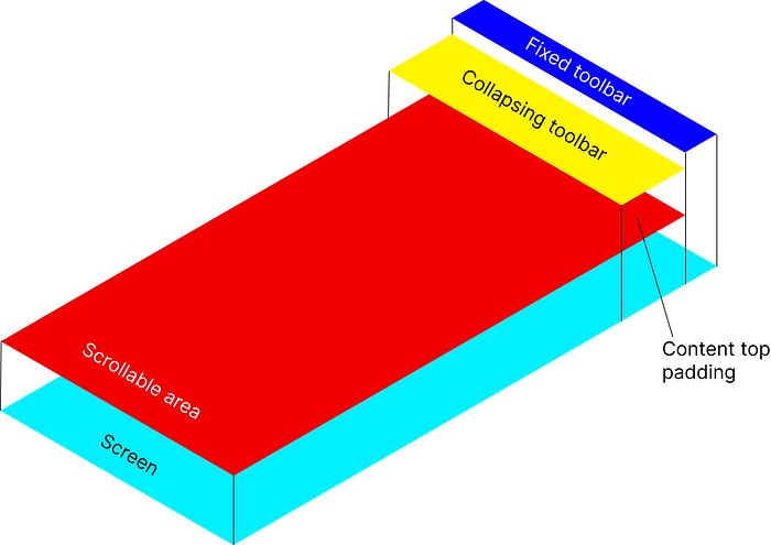
First, let’s figure out a general structure of this screen.

As you can see, our screen contains several layers. At the very top, a fixed toolbar is located (it’s optional). The next component is the collapsing toolbar. Pay attention, that the toolbar overlays our next component — the scrollable area (which is represented by LazyColumn). You should draw attention, that our scrollable area has a top padding for its content — just under the toolbar.
You can find a complete implementation here (as they say, “it’s better to see a code once”). The code is quite clear, and for this reason I’m going to explain key points only.
CoordinatedScroll function
At first, let’s look at CoordinatedScroll function — it’s a cornerstone of our example.
It takes two input parameters — a total height of collapsing toolbar and a composable function with content.
As you can see, all the magic happens in the onPreScroll method. It takes a delta available to consume for pre-scroll (available parameter) and returns the amount this connection consumed.
In this method, I calculate a new offset for our content (by adding a delta to the old offset) — this is done in the lines 12–18.
Next, I check that the offset is not greater than the total height of the collapsing toolbar (see the lines 20-24).
And, Bob’s your uncle, I pass the result offset to the content function (at the line 32).
And, at last, I return Offset.Zero value at the line 26, which means that the delta value has been processed completely and no additional processing is required for it.
ScrollableContent function
Now, let's have a glance at our scrollable area.
As you can see, it is a simple LazyColumn. The only subtle moment — you must set a padding for your content (it’s passed in contentTopPadding argument).
TopBarCollapsing function
The next function (collapsing toolbar) is a little bit more interesting. Let’s see the code first.
The first tricky moment lies at the line 15. In this line, I call onGlobalyPositioned function to calculate a full height of the toolbar. I pass the calculated value outside, then (see a callback in the line 6). This approach is quite flexible and allows me not to be tied rigidly to the height of the toolbar.
The second interesting point is at the line 8. In this line, I calculate a transparency factor for the text. And here I use a simplest way to make this calculation non-linear — I just raise the value to a fractional power. It’s amusing, isn’t it?
Pay attention to a the line 12 as well. In this line, our toolbar is being shifted (or collapsed, if you with) during the scrolling.
Root function
And last, but not least, a function that ties all the code together. I called it Root.
There are only two tricky moments here.
First, as you can see, the main content (I mean the toolbar and the scrollable area) are wrapped inside a Box, which, in turn, is wrapped in the CoordinatedScroll.
The second important moment — TopBarCollapsing overlays ScrollableContent (see zIndex in the line 28).
The rest of the code is quite simple.
The second case — not so simple
This is an actual case from one of my projects. At first, let’s have a look to an outcome result we would like to achieve.
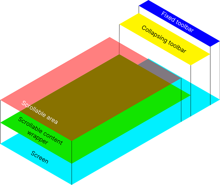
The only difference is that the scrollable content is wrapped in a Card (that was the desire of our interface designer), and that changes nearly everything.

You can find a complete implementation for the second case here. In general, it is similar to the first case, but there are some nuances that we’re going to consider.
CoordinatedScroll function
Let’s look at CoordinatedScroll function, it’s slightly different from the same-named function for the first case.
The difference starts at the line 26. The when block contains three branches:
1) If the toolbar is collapsed completely (the lines 27–28), I turn on internal scroll (by returning Offset.Zero);
2) The opposite case — the toolbar is expanded fully (the line 30). In this case I turn on internal scroll as well. I have to do it to complete current scrolling and preventing sticking of content in the scrollable area;
3) In any other case I block the scrolling in the scrollable area.
ScrollableContent function
Now, let’s take a look at ScrollableContent function. There are two differences from the same-named function for the first case. Firstly, LazyColumn is wrapped to a Card (according to the wish of an interfaces designer). Secondly, contentToPadding input argument affects the padding for all content, instead of just the list content (see the line 7).
TopBarCollapsing function
This function has not changed.
Root function
The Root function looks like the same. The only dramatic difference is in the line 36. As you can see, contentPadding value is affected by offset value now.
Conclusion
That’s all, folks! I really hope that this article will be useful to you! Full source code for the article can be found here.
